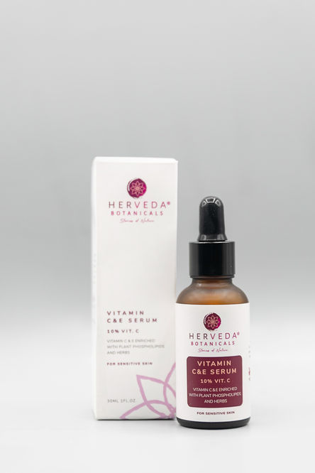
Simplicity is Key when it comes to Herveda's Packaging Designs.
Herveda Botanical's Natural and Wellness Skincare packaging is designed to be both simple and innovative, reflecting the natural and holistic approach to skincare. The packaging design in clean white, and is adorned with aesthetically pleasing brand icon of a lotus that captures the brand's commitment to beauty, wellness and natural elements. The product is easy to use and the packaging is both eye-catching and convenient, making it anyone's perfect skincare routine.
Services
Logo Design & Brand Identity
Packaging Design
Client
Herveda Botanicals
Year
2020 -2021
Link

Highlighting the Brand's Voice
Expressed with the concept of elegance and inspired with natural products to the core, Herveda Botanicals is a clinically curated skincare line that tackles all skin issues with their natural ingredients. Our design focuses on the brand's simplicity, using specific brand colours and suitable font for immediate recognition. The 'Lotus' icon is the main brand symbol of recognition.
Serenity & Simplicity
Striving to create great packaging, our team ensures
that it's eye-catching and memorable for everyone. The design stands out and makes a clear brand statement.
A good packaging means creating a design that is easily perceived as well as functional. We designed legible labelling for customers as some of the serums and vitamins were small in size.


